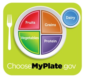
So much for mixing history with nutrition. The food pyramid, that iconic representation of what makes for a healthy diet, is being replaced by a … dinner plate. Score one for the literal. The new design was unveiled today, and marks another chapter in the ongoing war against misinformation when it comes to food groups. It features four colored sections, representing fruits, vegetables, grains and protein. Next to the plate is a smaller circle for dairy, suggesting a glass of low-fat milk or equivalent serving.
Note that despite my attempts — and I looked hard — I still could not find a section for gummy bears. One can wish- maybe the next revision I’ll be so lucky.
What’s in a design?
Frankly, I’m not so keen on the new look. Maybe it’s just me, but for one thing it looks really dumbed down. The whole of it contains 5 words, plus a web site address. That’s it?! Then again — silly dinosaur me — this could very well be the right kind of truncated thinking for a new Twitterized generation.
Then there’s the font: dullsville.
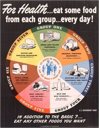
Post-war design seemed to really have it going on, in a board game kind of way… see the 1943 example below for a crazy cool mix of fonts, caps, and colors. Woah!

One of my favorite remarks about the new design is by someone as reported in the New York Times that suggested it looked like a painting by the artist Mark Rothko. If only I could be so clever.
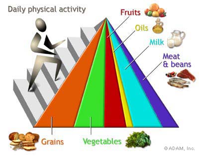
In it’s defense the new design is far better than the revised food pyramid that came out in 2005 (see below). Safe to say this is a gerat example of creativity gone wrong. If you squint it’s the result of a car accident between Pink Floyd’s Dark Side of the Moon, an Escher, and a shopping list.

Regardless, the important thing is not what I think. It’s what our school kids think that counts. If we’re talking attention span and message delivery I can’t help but wonder if a Harley, some Gaga leather and makeup, and a giant stiletto might be more effective choices.


