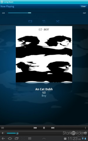
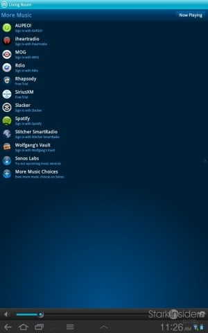
 Sonos today released the 3.6 system software update. If you’re on Android or iOS you can grab it now at the respective marketplaces. The desktop software should automatically prompt yo install the update. I downloaded the update on to every device around the Stark Insider office which includes a Samsung Galaxy Tab 10.1 (welcome back Australia), Samsung Galaxy Tab 7 (original), Apple iPod Touch, Samsung Galaxy S II, an iPad 2, and of course onto a few desktops as well. Can you tell that we’re slightly enamored with Sonos around here?
3.6 features the following updates:
— Sonos Controller for Android now supports tablets (note: although it worked fine before, now it is optimized for Android tablets) such as Kindle Fire, Moto Xoom, the aforementioned Galaxy Tabs, and more
— Slacker Radio is now available and free (by my count, Sonos now supports 11 free and paid music services: AUPEO!, iheartradio, MOG, Pandora, Rdio, Rhapsody, SiriusXM, Slacker, Spotify, Stitcher SmartRadio, Wolfgang’s Vault)
— the intro of Sonos Labs (hello Google!) where new music services can be tested in beta prior to official launch
— AAC+ codec support (won’t do this Google Music fiend any good)
Okay, not a world-changing update by any means. But any update that improves the tablet experience is a good start in my books. So I headed to Android Market and loaded up 3.6 on the Samsung Galaxy Tab 10.1 (by far my favorite Android tablet) and gave it a whirl.
Thankfully now takes advantage of the larger real estate afforded by tablets, primarily in the form of album art which looks generally pleasing, up front and center. Oddly, text is still somewhat small on some screens, and occupies about 10-15% of screen real estate in the top left. I’m not sure why Sonos doesn’t take advantage of the extra space which sits wasted with a subtle blue gradiated background. Another nit: this is not a gesture/swipe-friend app. Even a third party app for controlling the Logitech Media Server (formerly Squeezebox) such as Squeeze Commander takes advantage of gestures, allowing easy swiping from “now playing” to “music library” to “playlist,” etc. Sonos would do well for a 4.0 update that embraces these now-mainstream UI elements.
I gave the new Slacker service a spin. It’s now included free as part of the 3.6 update. In a word it’s great. My go-to will likely remain Pandora where you can type an artist or song title and get a personalized playlist on demand; but what I like about Slacker is its pre-defined radio stations. Click on “Slacker Stations” and you can find music aplenty, across several categories, such as: Blues, Classical, Hits, Rock, Seasonal, Jazz. In addition there is sportsradio (ESPN) and some interesting offerings such as the Slacker Spotlight and Artist Showcase. All worked well in my testing, with stations loading almost instantly. “The Top 50 Songs of 2010” is an interesting journey, and includes on-air commentary and background between tracks. But: Owl City?!

What I’d like to see in Sonos 4.o…
Integration with cloud music services like Google Music and Amazon – you should be able to point Sonos to the cloud instead of indexing tracks off a local hard drive.
Support of gestures like swiping, pinch and zoom, etc.
Support for complete album artwork, including packaged pdfs, images, photos, liner notes, etc.
.. let me know in the comments: what would you like to see Sonos improve?
Sonos remains the gold standard when it comes to streaming audio solutions for the home, and with the new, portable Play:3 for music on the go too. Moving quickly to apps for Android, and iOS was a smart move. And with the flexibility of set-up options offered by Sonos (including a non-amplified unit you can connect into your existing home theater/stereo) it should warrant strong consideration if you’re looking for a holiday gift for the household. The 3.6 update is minor, but as all things refined things in life, fine tuning requires a careful, delicate hand.


